Starbucks, the popular coffee company and coffeehouse chain, has been on the market since 1971. They have become famous worldwide for their quality coffee, as well as the customer experience. An important part of their history is the Starbucks Christmas coffee cups. Every year, they choose a different design for it, and people are curious to see what does the franchise bring new. Today we are going to have a look at the most interesting Starbucks Christmas coffee cups design they used in all these years since they’ve been on the market.
10. 1997
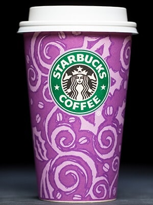
1997 is the year when the coffee shop first introduced colored holiday cups. Having a purple design for it, they were decorated with swirls, coffee beans, and hand-drawn holly. They had 4 jewel-toned hues, which you could choose for enjoying your Christmas Blend or Eggnog Latte, which were popular in that year as well.
9. 1999
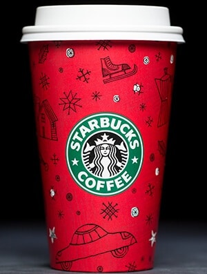
We jump two years into the future to admire the first appearance of the iconic Starbucks Christmas coffee cup design. This is the year when the franchise first introduced the candy red shade to their cups. In 1999, it came together with snowflakes, winter celebrations, and stockings drawn in black lines.
8. 2000
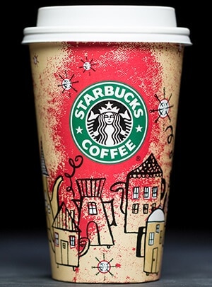
At the turn of the century, Starbucks decided to keep the red design for years to come. They only changed the decorations, and so, in 2000, we see an interesting design with the Coffeetown concept. The drawings on the cups depict a village of tea and coffee pots, set against a nighttime sky. It’s also worth mentioning that this is the year when we first got the chance to taste the famous Gingerbread Latte.
7. 2002
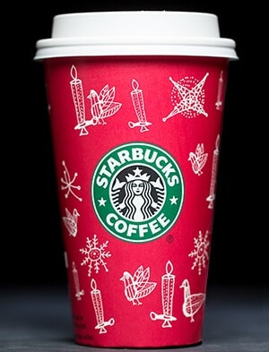
Yet another change in the Starbucks Christmas coffee cup designs appeared in 2002. This was the first time when the company decided to use white line art. The cups were adorned with snowflakes, candles, turtle duffs, and so on, all on the same red background we are already used to. The same style was also used in 2005 and 2016.
6. 2007
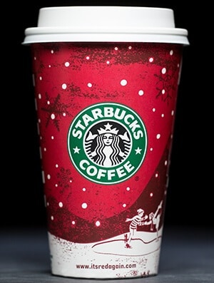
In 2007, Starbucks celebrated the 10th anniversary of their typical Christmas cup. Naturally, they kept the red shade and used the motto ‘Pass the Cheer’. The cup in 2007 depicted a classic snowy scene, with a child playing in the snow. There are also snowflakes drawn negligently on the cup, together with white dots.
5. 2009
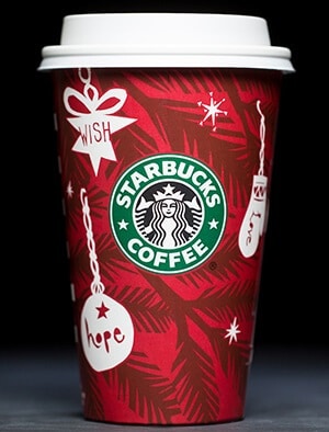
In 2009, we see the release of the ever-popular Caramel Brulee Latte. It was a hit, just as the design Starbucks chose for the cup. The typical coffee cup showed cut-paper ornaments on it. They were inspired by words meant to convey the meaning of the winter holidays for everybody: light, peace, joy, hope, love. The ornaments were hanged on sprigs of evergreen, depicted in a dark red shade.
4. 2010
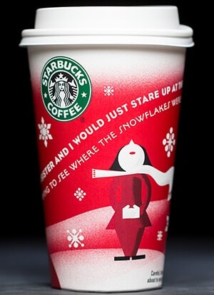
The design slightly shifted towards a modern take back in 2010. The modern vibe brought some new holiday characters that could be seen trying to catch snowflakes on the Starbucks Christmas coffee cups. The colors used by the team were red, white, and gray, which complemented nicely the cheerful atmosphere.
3. 2012
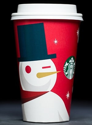
Don’t forget about the Christmas characters created back in 2010! In 2012, we got the chance to see them in a closeup. Coming with bold accents of gold and navy, people admired the snowman drawn in a minimalist style, all while they enjoyed their hot coffee. The lines are also sharper, which marks the modern look once again.
2. 2016
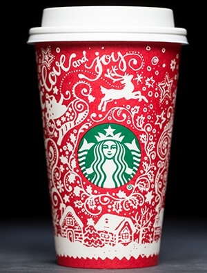
We’re closely getting to the top of our list of awesome Starbucks Christmas coffee cup designs and we couldn’t skip 2016. Last year, Starbucks came up with something new again. They featured customer-created holiday cups, which proved to be an attraction for everybody. They used 13 designs from 6 countries found all over the world. All of them were drawn by hand, in white, against the red background that is already iconic for this franchise.
1. 2017
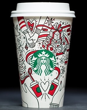
Finally, we couldn’t end the article without talking about the most recent release in the world of coffee. With another novelty, Starbucks unveiled the first white holiday cup. The design consisted of a pair of hands paired together with ribbons that swirled around. The rest of the cup was filled with splashes of green and red to convey the jolly Christmas atmosphere. So far, people seem to love this one.
2017 Insight
According to Leanne Fremar, who works as the executive creative director at Starbucks, the design they chose for this year was meant as a continuation of the one used last year. This means that their customers are encouraged to color the illustrations by themselves. You can say it is an adaptation of the idea they had last year, only now everybody is free to customize their own cup.
The person behind the design is Jordan Kay, from the Starbucks Creative Studio. Kay said that the hands were featured as a centering point. Whether we’re talking about wrapping presents, writing cards, decorating the tree, or simply drinking a cup of hot cocoa, the hands symbolize love, connection, and offering joy to others as well. Moreover, the cup sleeve they offer this year comes in a red shade. It invites people to ‘Give Good’, which is also the theme for the Starbucks holiday campaign this year
Conclusion
Starbucks has turned their Christmas coffee cups design into a true mission. Every year, they are trying to bring the best ideas to the table and to come up with a way of conveying the Christmas spirit. Anybody who looks at the history of the Starbucks Christmas coffee cup designs must admit there has been a clear evolution. From the simple purple design used in 1997 to the complex ones the franchise chose after the year 2010, we must admit some of them were true works of art. Perhaps the most significant shift the company made was the one that allowed their customers to interfere with the design, in 2016 and 2017. We’re already looking forward to the 2018 design!
Image sources: depositphotos.com, starbucks.com
Leave a Reply